7 Font Types and When to Use Them
This page may contain links from our sponsors. Here’s how we make money.
Font choice is an important part of web and graphic design. Whether you’re designing a logo, a brochure, a business card, product packaging, a website, or anything else, typography will have a huge impact on the finished product.
The look and feel of the design will change significantly with different types of fonts. Likewise, the impression and mood the design creates with viewers will vary based on the fonts and typefaces.
Because typography is such an important part of design, it’s critical to understand the various font types and when to use them. With some basic knowledge in this area, you’ll be able to create much more effective designs that get the intended results.
This article will cover the main types of fonts, how they differ from each other, and their best uses for designers.
Font Types
1. Serif

Serif typefaces are classic, elegant, and highly versatile font type. The distinguishing characteristic of serifs is the dashes or feet at the tops and bottoms of the letterforms or characters.
See our list of the best serif fonts.
The use of serif fonts is extremely common for many different purposes. They are especially popular for body copy in printed materials like magazines and newspapers. A serif font can also be used for titles, logos, online, and just about any other type of text.
One of the main reasons why serif fonts and typefaces are incredibly common is because they’re generally easy to read. This is true whether we’re talking about short text sections, like a title or headline, or a full page of text.
Although we’re lumping serif fonts together in one category, there are several different types or classifications of serif fonts. If you’re not a type nerd, you probably won’t care about the differences.
Popular Serif Fonts:
Psychology of Serif Fonts
Serif fonts are perceived as traditional and trustworthy, making them ideal for use in formal or professional settings.
They evoke a sense of timelessness, creating a feeling that the material is reliable and established. This makes a serif font a great choice for businesses or brands with long histories.
When to Use Serif Fonts
A serif font is well-suited for longer pieces of text such as books, magazines, newspapers, reports, presentations, etc.
A serif typeface also be used in logos to create an authoritative or sophisticated look. In addition, they work great in headlines if you’re looking for something more classic than a sans-serif option.
Related reading: Typeface vs. Font: What’s the Difference?
2. Sans Serif

Sans serif fonts do not have the small dashes or feet at the tops and bottoms of letters. Instead, they feature crisp edges. While serif fonts present more of a classic and elegant feel, sans serifs are more modern and clean.
See our list of the best sans serif fonts.
While serif fonts have a long history, It was within the last 100 years that sans serif typefaces gained popularity. Sans serif fonts are very versatile and can be used for just about any purpose. They look good in large sizes and are also readable in smaller sizes.
When designing for the web or anything that will be read on-screen, a sans serif font is the common choice for body copy or large portions of text. Sans serifs are also very effective for headers, especially in a heavy weight like a bold or black font.
Popular Sans Serif Fonts:

Psychology of Sans Serif Fonts
Whenever you use sans serif fonts, you’re creating an impression of modernity and cleanliness. This is especially true if they are used in light weights like regular or thin.
They create a feeling of trustworthiness and dependability, which makes them a great choice for businesses that want to appear professional yet approachable.
When to Use Sans Serif Fonts
Sans serifs are highly versatile, but the most common uses include body copy for screens (including websites and apps), headers, and logos.
Serif fonts and sans serif fonts can be used in many of the same situations, so the choice between the two comes down to the style of the design or the mood that you want to create. If you want to create something more modern and less classic, go with a sans serif.
3. Slab Serif

Slab serif fonts could be considered a sub-category of serif fonts, but we’re breaking them out into their own classification because there is an important distinction, and because they are extremely popular.
See our list of the best slab serif fonts.
The distinction between serif and slab serif fonts is that the feet or dashes on slab serif fonts are blocky. Also, the feet are often larger than what you’ll normally find with serif fonts.
Slab serif fonts are also popular, but they’re not quite as versatile as serif fonts. In general, slab serif fonts are not the best choice for body copy as they’re a bit harder to read as compared to serif or sans serif fonts.
As far as style and mood are concerned, slab serifs are more rugged and less elegant the serif fonts. A slab serif typeface also gives off an old style feel.
Popular Slab Serif Fonts:

The Psychology of Slab Serif Fonts
Slab serifs convey a sense of stability and strength. This makes them great for logos, headlines, or any time you want to evoke a feeling of confidence.
When to Use Slab Serif Fonts
They work well in logos and headlines but should be avoided in body text as they can be difficult to read in small sizes. Slab serif font can also give an old-fashioned or vintage vibe if that’s the look you’re going for with your designs.
4. Display

Display fonts, or decorative fonts as they’re sometimes called, don’t necessarily have a common theme or style. Of all of the categories covered in this article, this is the biggest, broadest category because so many different fonts can fit within the definition.
Decorative fonts are not intended for large amounts of text. You wouldn’t use a display font for a full page of text, and probably not even for a paragraph. They’re intended to be used for short amounts of text, like titles, headers, advertisements, or within branded images.
They can be playful or elegant. They can be thin or heavy. But decorative fonts are generally intended more for character and looks and style and less for readability.
Popular Display Fonts
There are so many different types of decorative fonts, and they are used for such different purposes that it’s harder to say which ones are most popular. But here are a few beautiful decorative fonts:

When to Use Display Fonts
Decorative fonts are appropriate for short amounts of text. This includes headlines, logos, and advertisements. It’s also best to use decorative fonts in large sizes as they can be difficult to read in small sizes.
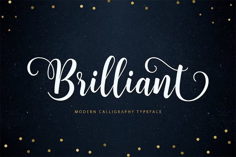
5. Script

Script fonts generally use cursive letters and resemble the look of handwriting. They can be elegant and stylish but also challenging to read. A script font is not appropriate for body copy or large amounts of text since they’re more difficult to read.
Popular Script Fonts:
Psychology of Script Fonts
Script fonts convey emotion, elegance, and sophistication. They are also seen as romantic, which can be helpful in certain designs or applications.
When to Use Script Fonts
A script font is best used for short text, such as headlines or logos. You may also see them used in invitations, wedding announcements, and other printed materials that call for a more elegant look. It’s important to note that you should use script fonts sparingly and at large sizes since they can be difficult to read when small or when there are large amounts of text written with the font.
6. Handwritten

Handwritten fonts can be similar to script fonts, but there are a few distinctions. Most significantly, script fonts typically use cursive letters, while handwritten fonts may or may not be in cursive.
See our list of the best hand-drawn fonts.
Also, while script fonts resemble handwriting, they are not usually intended to completely replicate handwriting. Handwritten fonts are intended to look like the text was actually written by hand rather than simply inspired by handwriting.
Like decorative fonts and script fonts, handwritten fonts are inappropriate for body copy since they’re much harder to read.
Examples of Handwritten Fonts:

Psychology of Handwritten Fonts
Handwritten fonts can evoke a feeling of friendliness and warmth. They can be used to give a personal touch to your designs. Handwritten fonts are also often seen as more playful or lighthearted than script fonts, making them the perfect choice for certain applications.
When to Use Handwritten Fonts
This font style should be used sparingly and at large sizes since they are difficult to read in small sizes or when there is a lot of text. They can be used for logos, headlines, advertisements, and other short amounts of text.
7. Blackletter

The last of the font types that we’ll cover is blackletter or gothic. While blackletter fonts are not as commonly used as the other styles of fonts today, they still serve a purpose in the right situation. They typically contain a combination of thick and thin strokes.
See our list of the best blackletter fonts.
These fonts are based on medieval calligraphy and are very ornate. They’re very difficult to read, so they’re only appropriate for single words or very short lengths of text.
Examples of Blackletter Fonts:

Psychology of Blackletter Fonts
Blackletter fonts evoke a feeling of history, formality, and power. They can be used to create a mysterious or sophisticated look. However, they’re not appropriate for body copy since they are so hard to read and should only be used sparingly at large sizes in logos, headlines, or other short amounts of text.
When to Use Blackletter Fonts
Blackletter fonts should be used sparingly for very short pieces of text such as logos, single words, or short phrases. They’re not suitable for long text lengths due to their difficulty in readability. It’s important to use them correctly and in the right context so that your message is still conveyed clearly.
What Types of Fonts are Best for Websites?
There’s no one-size-fits-all answer to the question of what types of fonts are best for websites. The right font type for a particular website or brand will depend on several factors, including the type of content that will be published on the site and the overall design aesthetic and appearance the brand or site owner is aiming for. That said, some general guidelines can be followed when choosing main types of fonts for a website.
For example, sans-serifs are generally more readable on screens than serifs. This is because sans-serif fonts do not have the small decorative details that serif fonts do, making them difficult to read in small sizes. As such, sans-serif fonts are often a good choice for body text on websites.
Similarly, display or decorative fonts should be avoided for body copy as they can be difficult to read. However, these types of fonts can be used effectively for headlines or other short pieces of text that need to grab attention. When using display fonts, it is important to use them sparingly and pair them with a more readable font for the majority of the text on the page.
How to Choose the Fonts for Your Website
There are a few things you need to take into account when choosing types of fonts for your website. The first is what type of font you want to use.
The second thing you need to consider is your brand. What type of image do you want to project? Formal or casual? Traditional or modern? Your font choice should reflect that.
Finally, you need to choose a font that’s easy to read. That means it should be legible in various sizes and have a consistent style throughout. Different fonts and typefaces can have different effects on how easy they are to read, so you’ll need to experiment to find the right font type for your website.
Ultimately, the best way to figure out what font or fonts and typefaces are right for a particular website is to experiment with different options and see what looks best. By trying out different options, it’s possible to find the perfect font (or combination of fonts) for any website.
What are Web Fonts?
Web fonts can be used on websites. They are typically hosted by a third party and embedded into the website’s code. This allows a website to display text in fonts that may not be available on the user’s computer, allowing for more design flexibility.
Where to Find Web Fonts
Envato Elements is the best resource for fonts and web fonts. You can access a massive collection of fonts (with commercial licensing) for one low monthly or yearly price. You’ll get all the fonts you need for a fraction of the price of licensing them individually.
Final Thoughts
Choosing the right types of fonts is a critical part of the design process. By understanding the differences between the most common font types and when they should be used, you’ll be able to drastically improve the quality and effectiveness of your design.