Logo Evolution: The Growth Of Corporate Logos
This page may contain links from our sponsors. Here’s how we make money.
There’s a lot to learn by studying the logo evolution of major brands and well-known products. Trends change all the time and they can lead to radical design changes across societies and cultures.
I’ve looked into some of the world’s largest companies and how much their logos have changed over time. We can learn about design techniques, cultural history, and perhaps even conclude some ideas regarding the future of logo design.
On the topic or corporate designs, be sure to see our showcase of beautiful corporate websites.
The Evolution of Corporate Logos
NBC
The National Broadcasting Company has a rich history dating back to the early 1920s when radio was just picking up steam. Extant remnants of old-time radio still linger across the web as a reminder of NBC’s long-time growth to its modern success.
If you look at the early logo designs, you’ll notice they center around radio. Movies were picking up steam, but radio was in. Sometime around the 1940s-1950s NBC got more involved in television and changed up their logo to reflect a more generalized media company.
But it wasn’t until 1956 that their first peacock logo appeared. The colorful peacock feathers really stand and still continue in use to this day.
Apple
Practically a story as old as time, Jobs and Wozniak founded Apple computers sometime in the mid-1970s. Their first logo was Isaac Newton under an apple tree drawn by Ronald Wayne in 1976.
The history of Apple is long and has radically changed the face of the entire world. Their colorful Mac Apple logo with the bite missing first surfaced in 1977. Since then it has undergone some aesthetic changes with transparent effects and glossy textures.
But the core Apple logo remains the same and is recognized the world over as a trendsetting corporation.
Pepsi
We find the history of Pepsi dates back to 1893 with a very nineteenth-century logo design.
Pepsi-Cola branded itself with the hyphenation for over fifty years since inception. It kept the same calligraphic logo with only minor adjustments up until the early 1960s.
From here Pepsi dropped the “cola” from its name and simplified the branding with a red white & blue color scheme. This still remains as Pepsi’s iconic color pattern, albeit altered slightly in 2009 with a tilt in the sphere icon.
Microsoft Windows
The Seattle-based tech company Microsoft and their operating system Windows have both seen many logo iterations.

A look at Microsoft’s history will show that their logo went through typical fads of each decade. The 70s logo has commonplace swoopy letters, the 80s logo seems like a heavy metal band, and the 90s logo grew up and got corporate.
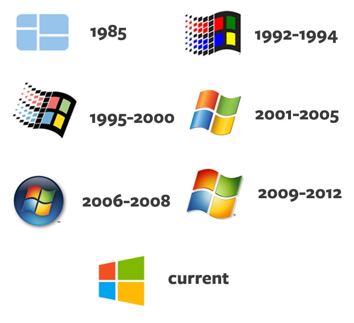
Windows followed a different trajectory having mostly gained notoriety in the 1990s. It has always kept the four squares with red, green, blue and yellow in each panel. But the design techniques have grown and appeared more technical over time – that is, until their recent switch over to the flat logo with a skewed perspective.
Hewlett-Packard
The large computer manufacturing company Hewlett-Packard has an interesting history of incorporation in 1947 with a public IPO in 1957.
As you can tell their first logo was brilliantly simple. Over the decades it seems HP has maintained this simple logo design. Color was introduced in the 80s and the dark shade of blue is now predominantly tied to their identity.
It’s hard to imagine where the world would be without Google. The company first launched in 1997 and in a short twenty years has risen to the #1 search engine on the planet.
Their early logos reflect the somewhat cheesy-yet-loveable styles of ’90s design. They eventually settled on a heavy bevel-and-emboss design in late 1999 which ran for more than ten years. This is perhaps the iconic Google logo that everyone knows and loves.
Since then Google has gone the way of flat design and ultimately scrapped their serif font for a sans-serif font in 2015.
Yahoo!
Another well-known search engine Yahoo! has seen its own corporate history of logo changes. In the mid-90s Yahoo ran with brightly-colored logos that matched the design of the time.
Moving into the late 90s we see Yahoo really matured with a fun yet crisp font choice. Since the turn of the century their logo has not changed much at all. It has veered towards a purple color scheme but retains the exclamation point as a design feature.
DC Comics
The legendary DC Comics brand has been around since the 40s and has retained is circular logo for decades. It’s only up until their latest rebranding in 2012 that they dropped the circle and moved towards a whole new concept.
But the early years all featured the capital DC letters fixed inside a circle. Somewhere in the mid-70s, DC added stars into the circle. These stars morphed into future logo designs and the star symbols are now often associated with the DC brand itself.
AT&T
A big player in the modern media communications conglomerate monopoly is AT&T. They’ve been around for a long time and the company’s history dates back to the invention of the telephone with The Bell Telephone Company.

The actual inception of AT&T’s globe logo was in 1983, but it kept the Bell Telephone logo for over a decade prior.
AT&T has purchased many other entities like Cingular to incorporate their branding across multiple communication mediums of landline and mobile phones.
Adobe Photoshop
Although technically not a corporation, Photoshop is a long-running digital design program that recently celebrated its 25th anniversary. That’s a long time coming and it’s beautiful to see how much Adobe has altered the Photoshop logo design.
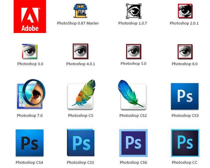
During the early years of Photoshop it was recognized by the small eye and magnifying glass. This ended with Photoshop CS in 2003 which introduced the feather icon.
Once Adobe purchased Macromedia they updated their creative suite with a whole slew of new products. Ever since the release of CS3 in 2007 Adobe has held the two-letter iconic logo styles for all of their products, making slight color alterations with each new version.
Wrap-Up
By studying the history of corporate logos you can pick up design trends and ideologies that change over time. Larger corporations tend to be older and thus have more of a history to look into.
But you can learn a lot even from smaller companies and their affixed logo updates. This is helpful to both designers and entrepreneurs who want to understand the identity design process.
To read more about brand design check out these related articles: